
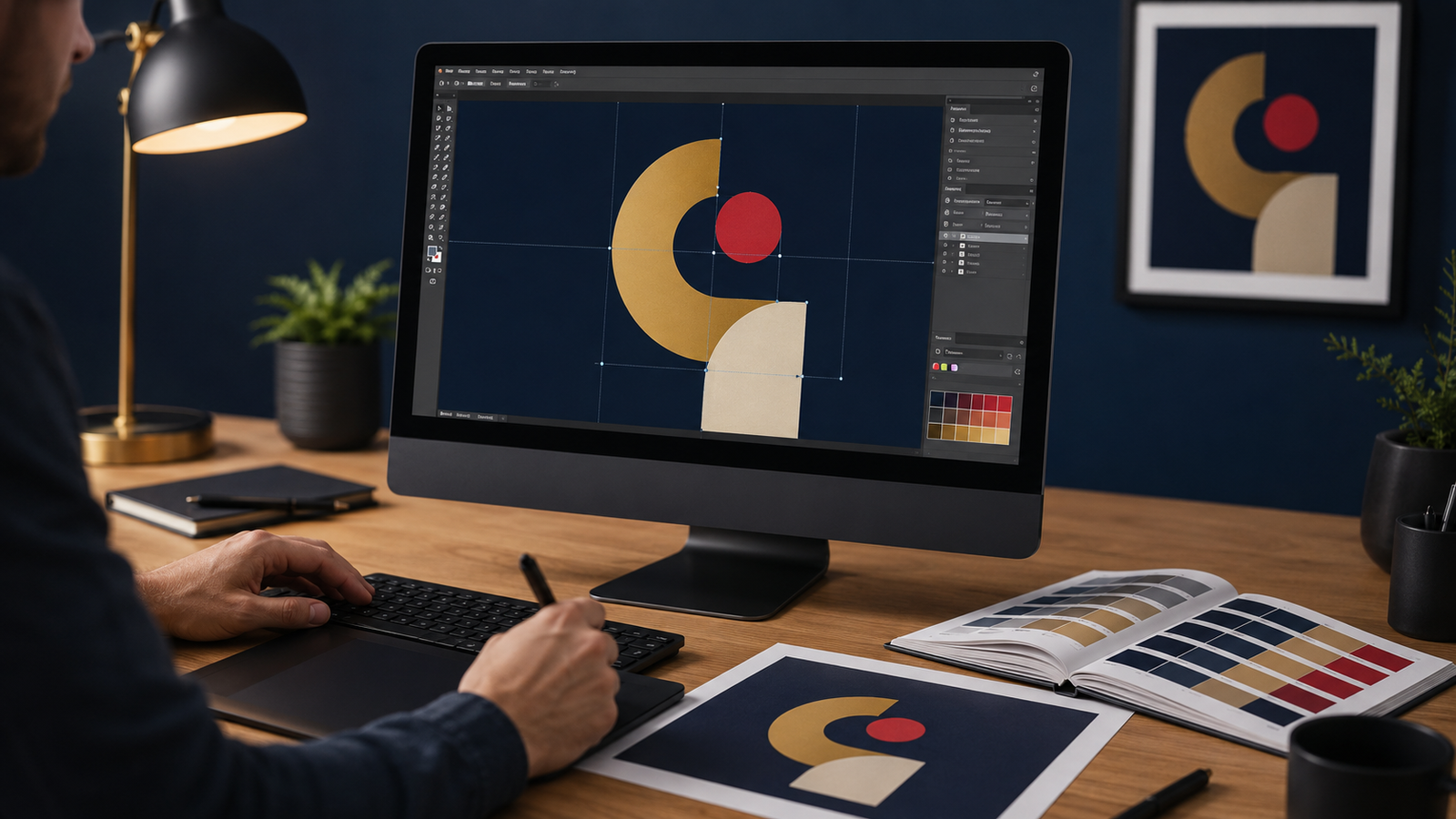
The single most common cause of disappointing branded products is not the printing — it is the artwork supplied for it. A logo that looks perfect on a website can print blurry at three metres, and a colour that looks right on one screen can arrive wrong on the product. This guide explains, in plain language, how to prepare print-ready artwork so your branding comes out crisp, correctly coloured and exactly as intended — whichever method is used. It supports our guide to branding and printing methods.
Vector vs raster: the most important distinction
Almost every artwork problem comes down to this one concept. Files are either vector or raster, and it changes everything about how they print.
| Vector | Raster (bitmap) | |
|---|---|---|
| Made of | Mathematical paths and shapes | A grid of pixels |
| Scaling | Scales to any size with no quality loss | Becomes blurry or blocky when enlarged |
| Best for | Logos, text, line art, most branding | Photographs and complex images |
| File types | AI, EPS, PDF, SVG | JPG, PNG, GIF, TIFF |
The rule of thumb: logos should always be vector. A vector logo can be printed on a pen or a building-sized banner from the same file. If you only have a raster logo (a JPG or PNG), it can often be redrawn as vector — a step worth taking once, because it fixes the problem forever.
Resolution: when raster is unavoidable
For photographs and complex images, raster is unavoidable — and then resolution is everything. Resolution is measured in DPI (dots per inch); print generally wants around 300 DPI at the final print size. The trap is that images look sharp on screen (which needs only about 72 DPI) but print blurry. A small web image blown up to fill a banner will look soft and pixelated. Always supply raster images at, or scaled proportionally to, the actual size they will be printed — and remember you cannot add real detail by enlarging a small file; the quality has to be there to begin with.
Colour: why your blue may not be your blue
Colour is the second most common complaint, and it is avoidable. Screens display colour in RGB (light), while most printing uses CMYK (ink) or spot colours; the two do not map perfectly, so a vivid on-screen colour can shift in print. The fix is to define brand colours as Pantone (spot) colours, which give the supplier an exact target to match across materials and production batches.
- Specify Pantone references for brand-critical colours rather than describing them by name.
- Expect slight variation across materials — the same colour reads differently on white plastic, brushed metal and fabric.
- Approve colour on a physical sample where colour matters, not on a screen proof.
- Ask the supplier to record the batch so re-orders match the originals.
Different methods also reproduce colour differently, which is another reason to match your artwork and expectations to the chosen method — see the methods guide and, for garment work specifically, the difference between screen printing and direct-to-garment printing.
The technical checklist before you send artwork
- Vector logo supplied (AI, EPS or PDF) — or a high-resolution raster at final print size.
- Fonts outlined or supplied so text does not reflow or substitute.
- Colours specified as Pantone references for brand-critical elements.
- Correct size and any bleed — artwork built at the finished dimensions with a safe margin around edges.
- Transparent background where needed and layers kept editable if the supplier may need to adjust placement.
- One clear master file — avoid sending several slightly different versions of the same logo.
What to do if you only have a logo from your website
This is a very common situation, and it is fixable. A small web logo (a JPG or PNG copied from a site) is low-resolution raster and will not print well at size. The right first step is to locate the original vector logo — often held by whoever designed your brand — or have the logo professionally redrawn as a clean vector file. It is a one-time task that pays off on every future order, from a pen to a banner. A good supplier can usually help arrange this, and it is one of the practical reasons to work with a capable partner, as covered in how to choose a supplier.
File formats explained
Knowing what each file type is for removes most of the confusion when a supplier asks for artwork.
| Format | Type | Use it for |
|---|---|---|
| AI | Vector (Adobe Illustrator) | The master logo/source file — fully editable |
| EPS | Vector | A widely-compatible vector logo for print |
| Vector or raster | Sharing artwork; keep vector content inside for scalability | |
| SVG | Vector | Web and some print workflows |
| PNG | Raster | Web images and logos with transparency — not ideal at large print sizes |
| JPG | Raster | Photographs — no transparency; avoid for logos |
| TIFF | Raster | High-quality photographic print images |
If you can only provide one file, a layered AI or a vector PDF of your logo is the most useful, because it can be scaled and adapted for any product and any method in the branding methods guide.
Common artwork mistakes to avoid
- Sending a small web logo (JPG/PNG) and expecting it to print sharply at size — supply vector instead.
- Describing colours by name (‘our blue’) rather than specifying Pantone references.
- Not outlining fonts, so text substitutes or reflows on the supplier’s system.
- Building artwork at the wrong size or with no bleed, causing scaling and edge issues.
- Sending several slightly different logo versions without indicating the correct master file.
- Approving colour on screen only — always confirm on a physical sample where colour is critical.
Get artwork right, get branding right
Mustang Advertising has prepared and produced branded artwork for UAE businesses since 2007, with design and production under one roof in Dubai. Learn about the group on our companies page, contact the team if you need help getting your logo print-ready, or browse and request a quote at giftsuppliers.ae. To understand which method your artwork will be printed with, start with the branding and printing methods guide.
Frequently asked questions
What is print-ready artwork? Artwork prepared so it prints exactly as intended — typically a vector logo (or high-resolution raster at final size), fonts outlined, colours specified as Pantone, correct dimensions with bleed, and a clean master file.
What is the difference between vector and raster? Vector art is made of mathematical paths and scales to any size without losing quality — ideal for logos. Raster art is made of pixels and becomes blurry when enlarged — suitable for photographs at the right resolution.
Why do my printed colours look different from my screen? Screens show RGB light while printing uses CMYK or spot inks, so colours can shift. Specify brand colours as Pantone references and approve a physical sample to control the result.
What resolution should print artwork be? Around 300 DPI at the final print size for raster images. An image that looks sharp on screen at 72 DPI will print blurry, so supply files at the actual size they will be printed.
I only have my logo from my website — is that enough? Usually not — web logos are low-resolution raster and print poorly at size. Find the original vector file or have the logo redrawn as vector once; it then works on every future order.
What file format should I send my logo in? A vector file — AI, EPS or a vector PDF — is best because it scales to any size without losing quality. Reserve JPG and PNG for photographs, not logos.
Can my logo be recreated as a vector file? Usually yes — a low-resolution or raster logo can be redrawn as clean vector art. It is a one-time task that then works on every product and method.
Why should fonts be outlined? Outlining converts text to shapes so it cannot substitute or reflow on another system, keeping your typography exactly as designed.
What is bleed? Bleed is extra artwork extended beyond the trim edge so that, after cutting, there are no unprinted white edges. Build artwork at the finished size with a safe margin around critical content.
What resolution do I need for a banner? Aim for roughly 300 DPI at the final print size, though large banners viewed from a distance can use a lower effective resolution. The key is to build the file at, or scaled to, the actual print dimensions.
Should artwork be RGB or CMYK? Screens use RGB; most printing uses CMYK or spot colours. Supply artwork prepared for print and specify Pantone references for brand colours so the supplier can match them accurately.
Can you match my exact Pantone colour? Suppliers match Pantone as closely as each method and material allow. Because surfaces and processes reproduce colour differently, approve colour on a physical sample where it is brand-critical.
Can you help prepare my artwork for print? Yes — Mustang Advertising has design and production under one roof in Dubai and can prepare or redraw your logo as print-ready vector artwork before production.